COBI
The first smart connected biking system
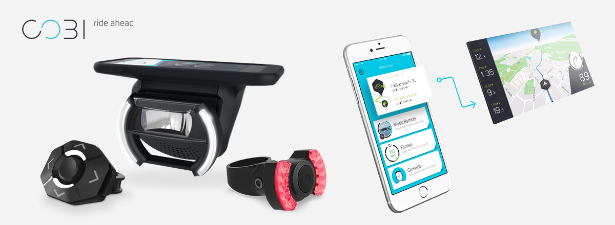
COBI.Bike is a system that converts any bike into a connected smart bike. The system consists of hardware components that are mounted on the bike and a smartphone App. With COBI.Bike, the smartphone itself is used as an intelligent bike cockpit and control unit. In addition to information about the current speed, battery and support level on e-bikes, the app offers further functionalities such as navigation, weather forecast, fitness tracking, music streaming and making phone calls with Bluetooth headphones. To increase safety, everything is controlled with a thumb controller from the handlebar. Further, the system comes with a smartphone charging function, an automated front light and wireless rear light, an electronic bell, an intelligent alarm system, and turn signal function.
Focus
concept development of a hardware and software synchronised notification and status feedback systemTools
Pen and Paper, Post-its, Markers, Excel, Lucidchart, Sketch, After Effects, Photoshop, AuditionMethods
interviews, brainstorming, experience prototyping, wireframing, prototyping, user testingYear
2015/2016Extract
During my time working as User Experience Designer at COBI.Bike I was responsible for a variety of tasks. As main UX Designer my core responsibility lay in the concept development for the overall system, the conception of new features, as well as documentation. Further, my scope of activities included user research, organisation, execution and evaluation of user tests and surveys, creation of flowcharts, screen flows, wireframes and low-fi prototypes.
To give an insight into my work at COBI, I describe the basic process and concept creation of the notification and status feedback system.
Research & Fieldwork
In a first step, a competitor analysis was carried out. For this purpose, different navigation apps and new smart biking products were examined, and their feedback structures were analysed. Cyclists were interviewed to gain insights into which systems are used, how their feedback and notification functionalities are perceived and evaluated, and what additional information would be desired. Furthermore, cyclists who had already heard of COBI were asked what they expect from the system in terms of general features, behaviour, feedback functions, etc.
Some leading questions during that phase were:
- What kind of bike systems are comparable?
- What types of feedback and notifications are users used to in different systems and contexts?
- What kind of behaviour is expected from COBI?
- What kind of feedback and notifications are missing and what is desired?
Ideation & Concept development
The results of the research and fieldwork phase showed that COBI can be compared to automotive systems in some aspects. Based on these findings, the identified user needs and desires, user stories and scenarios were created.In several brainstorming and collaborative sketching sessions, feedback types and priorities were defined. As COBI.Bike is a system consisting of hardware components and a mobile app, it was particularly important to take a holistic approach. Team members from all relevant departments were directly involved in the brainstorming and concept development process to ensure that the hardware and software feedbacks are exactly aligned, and that the system provides the necessary information even if it is used without a smartphone.
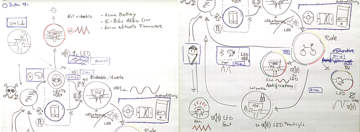
For the so-called stand-alone mode, i.e. use without a smartphone, it was important to communicate various states and events directly via the hardware and to design them in such a way that no overload of stimuli is generated when the system is used with a phone. In order to test a large number of possible feedbacks with light and sound, a video prototype was created. This allowed changes to be made quickly and easily before they were implemented.
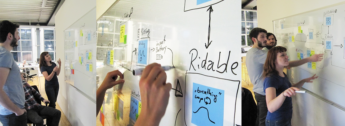
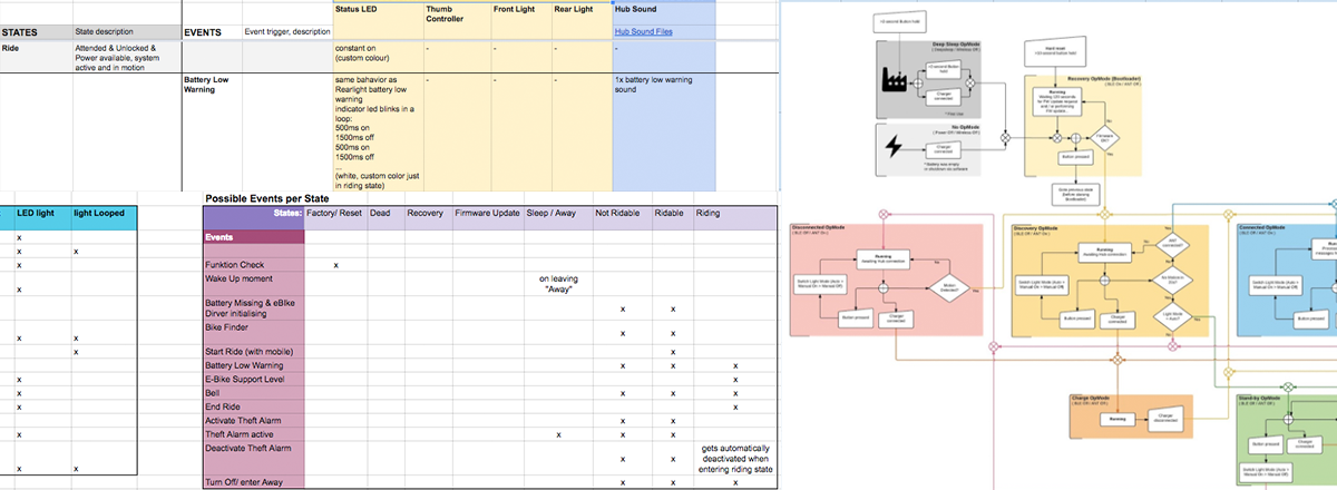
In addition to the sound and light feedback on the hardware components, corresponding feedback and notifications also had to be designed for the app. Depending on whether one is driving or standing, a different screen is visible. The positioning, size and amount of information displayed therefore had to be precisely defined. While it should be possible to obtain more precise information on certain statuses and error messages on the homescreen, too extensive messages should be avoided as far as possible while driving for safety reasons.
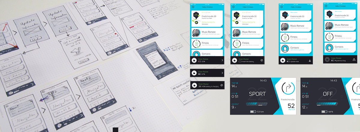
Some leading questions during that phase were:
- Which states and events need to be communicated to the user?
- What kind of feedback can be given in which form? (sound, lights, vibration, app notification, information-bar, etc.)
- Which components of the system should be included and which left out?
Testing & Iterating
Ongoing tests were conducted throughout all phases. As some feedbacks could only be properly tested by using COBI directly when riding a bike, most test runs were made with a small group of external testers and employees. among others, the following questions should be answered by testing and iteration:- Are all feedbacks on the hub LED, the front light, the rear light, the thumb controller, in the app, and combinations easy understandable?
- Are the used sounds perceived as appropriate to communicate respective states and events?
- Do sound feedbacks work in every environment?
- Are some feedbacks perceived as annoying or distractive?
- etc.
Result
Due to a collaborative work process including several iterations and user tests, a well-rounded concept for the feedback and notification system could be created. The final implemented result can of course only be experienced by directly using COBI and go through different states and trigger certain system events. Nevertheless, I can present a graphically prepared diagram that displays all states and events, feedback types and possible orders of events.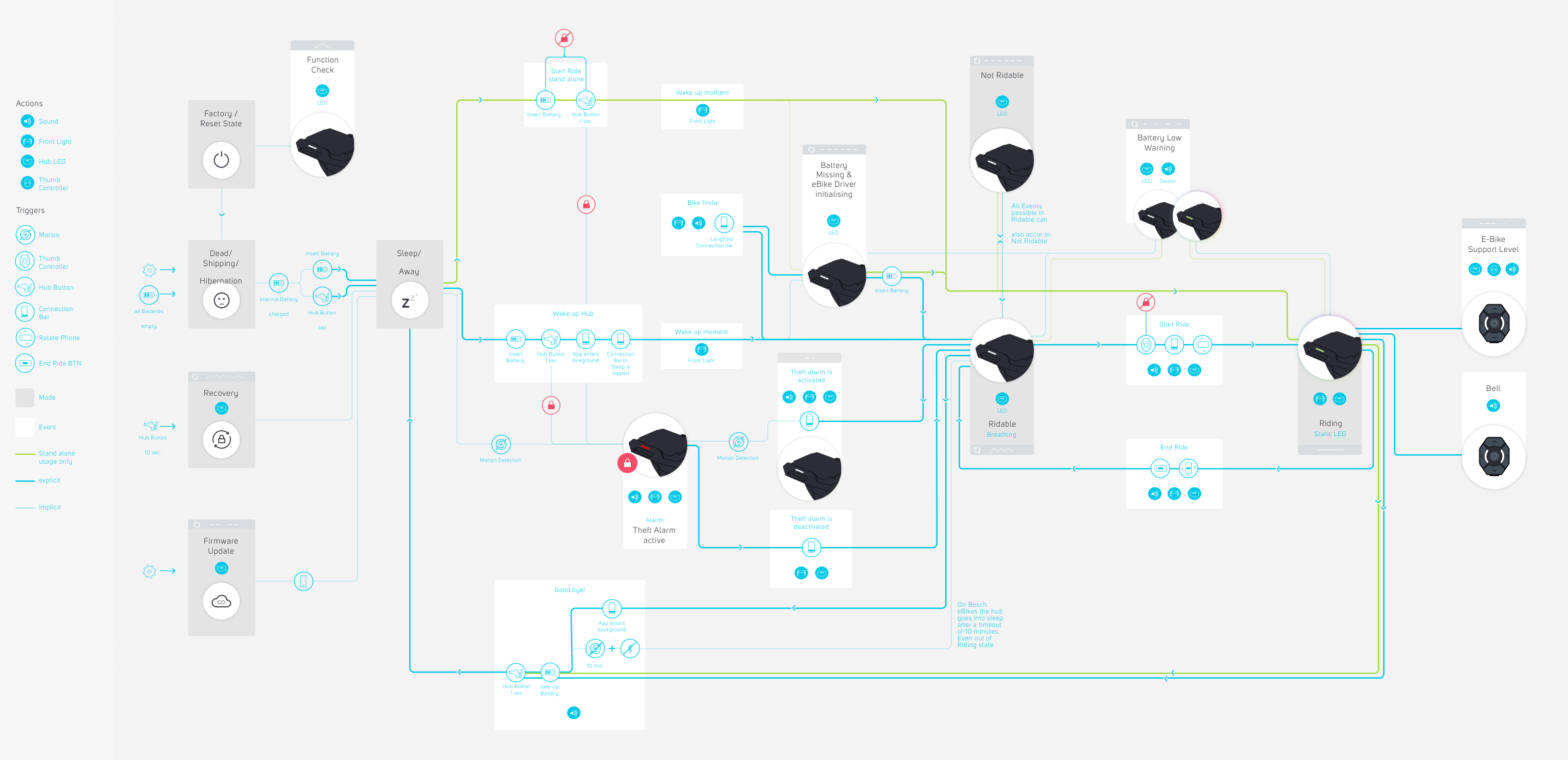
In addition to the COBI user manual, videos of the final hardware feedback were created to enable the user to understand and look up certain feedbacks faster and easier, but also to give potential customers a more detailed impression of the system.
All status feedback videos can be found here